
I Built My Own Personal Finance App with Google Antigravity

I've bootstrapped software businesses to $1.2m in ARR. I know my way around a P&L statement. But for the longest time, my personal finances were a dumpster fire of disconnected spreadsheets and "set it and forget it" subscriptions that I definitely forgot.
My girlfriend (Lindsay) and I tried everything. Mint (RIP), YNAB, Monarch, Copilot. They're all... fine.
But "fine" doesn't work when you have specific goals. We didn't just want to track expenses; we wanted to gamify our frugality. We wanted to see who was winning the "Least Spent" award each week. We wanted to track our house appreciation right next to our ETF performance without paying $100/year for the privilege.
So, I did what any rational vibe-coding developer with too little time does: I decided to build my own personal finance app.
But this time, I didn't write every line of code. I used Google Antigravity (Google's new agent-first IDE) and Gemini to build a tailored solution that actually fits our lives.
The Problem with "Off-The-Shelf"
Most budgeting apps are built for the average user. They assume you have standard 9-to-5 paychecks and simple shared expenses. Lindsay and I needed something specific:
- The "Split" Button: We split a lot of shared costs 50/50. In most apps,
this is a manual math nightmare. I wanted a single button that says
Split 50/50and updates both our ledgers instantly. - The Competition: We wanted a literal scoreboard. Who is saving more this month? Who is the "High Spender" (emoji included 😬)?
- True Net Worth: I wanted our Zillow estimate to sit right next to our Plaid investment feeds. Real-time reality checks.
The Stack: Google Antigravity & Gemini
I used to waste weeks setting up environments. "Mistake #35" in my book was putting design over utility, but Mistake #36 was definitely over-engineering the starting line.
Enter Google Antigravity. It's an "agent-first" IDE. Instead of just autocompleting my code, I treated Gemini like a junior dev who never sleeps.
- Frontend: Next.js 16 (App Router)
- Styling: Tailwind CSS 4 (because I'm done fighting CSS)
- Backend: Supabase (Auth & Postgres)
- AI: OpenAI (for categorizing messy bank transaction names)
The "Killer Features" We Built
1. The Transaction Hub
The transactions view is where most of the magic happens. Every purchase, every payment, every dollar—it all flows through here. But what makes it powerful isn't the data; it's the actionability.
Each transaction row shows the date, merchant, amount, and automatically assigned category. I integrated Plaid's transaction sync, which pulls in real-time data from all our connected accounts. But here's where it gets personal: I added a "User" column so we can assign every expense to either Travis, Lindsay, or mark it as "Split 50/50."
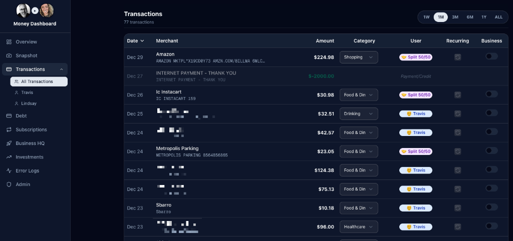
The UI also supports quick filtering by time range (1 week to all-time) and lets us flag transactions as "Recurring" or "Business" with a simple toggle. When I spot that $224.98 Amazon charge? One click assigns it to me, categorizes it as Shopping, and the dashboard instantly updates. No manual entry, no syncing delays.
2. The Monthly Financial Snapshot
This is the "at-a-glance" view that answers the question we ask every Sunday: "How are we actually doing this month?"
The Snapshot view splits the screen into two columns: Income on the left and Expenses on the right. Income shows each of our individual contributions plus a combined total. Expenses are broken down by category—from fixed costs like mortgage and car payments to variable spending like dining out, travel, and shopping.
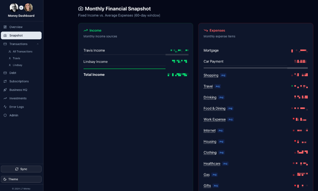
The real power here is in the trend indicators. Those little arrows next to each expense category show whether we're spending more or less compared to the previous period. Red arrows pointing up mean we're overspending; green arrows pointing down mean we're winning. It's instant feedback on our financial behavior without digging through spreadsheets.
I also built this view to pull from a 60-day rolling average, which smooths out anomalies like one-off purchases. That mortgage line? It's the same every month. But "Food & Dining"? That fluctuates, and seeing the trend helps us course-correct before it gets out of hand.
3. Debt & Liability Overview
One of the biggest gaps in consumer finance apps is a clear view of what you owe. Yeah, they'll show your credit card balances, but rarely in a way that feels comprehensive. I wanted a "war room" view—every loan, every credit card, all in one place with real balances updated via Plaid.
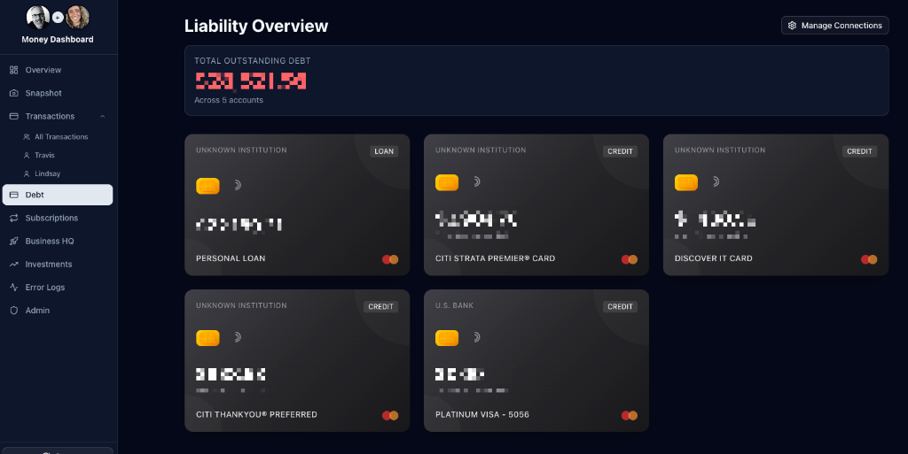
This view displays each liability as a visual "card" with the institution name, account type badge (Loan vs. Credit), and the last four digits of the account. The header shows total outstanding debt across all accounts—a number that's both motivating and, occasionally, terrifying.
The key insight here: visibility drives action. When you see all your debt laid out like this, it becomes harder to ignore that personal loan or justify carrying a balance on multiple credit cards. This view has single-handedly changed how we prioritize payoffs.
4. Subscription Tracking
Remember those "set it and forget it" subscriptions I mentioned? This feature was built specifically to kill the zombie subscriptions.
The Subscriptions view uses an algorithm to detect recurring charges by analyzing transaction patterns across all connected accounts. It identifies charges that repeat on a consistent schedule (weekly, monthly, annually) and groups them into "Active Subscriptions." The dashboard shows total monthly recurring costs, count of active subscriptions, and flags any newly detected candidates for review.
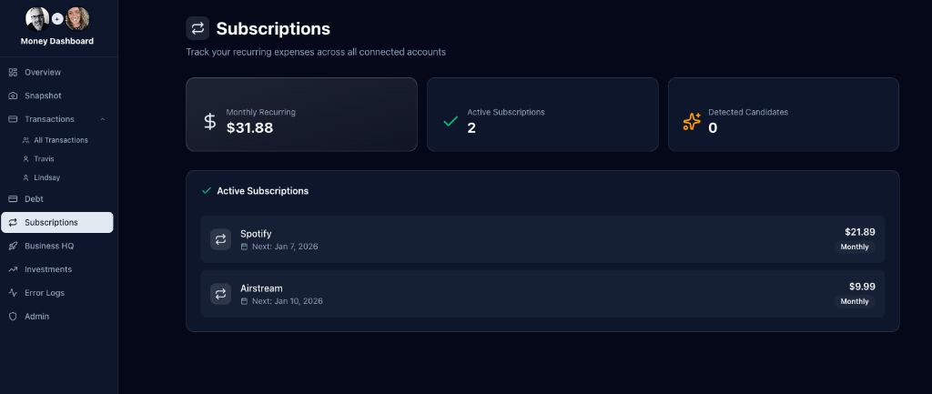
Right now, we've got Spotify ($21.89/month for the family plan) and Airstream ($9.99/month—long story, but yes, we're planning a road trip). The "Next:" date under each subscription is the real utility; it reminds me exactly when the next charge is coming so I can cancel before getting hit with another renewal.
This feature alone has saved us about $50/month by surfacing forgotten trials and services we stopped using but never cancelled. That's $600/year—more than enough to justify the time spent building this app.
5. One-Click Transaction Splitting
We built a custom TransactionTable component. If I pay for dinner, I click one
button: "Split 50/50".
The app instantly updates the assigned_user_id to null (shared), sets a
is_split flag to true, and visually updates the row to purple with a split
icon. No calculator app required.
// The code that shames me every month
const highSpender = userTotals[0];
const winner = userTotals[userTotals.length - 1];

// Result: 🏆 Lindsay vs 😬 Travis
Why You Should Build Your Own
You might think, "Travis, this sounds like a lot of work just to save $10/month." You're missing the point.
When you build your own personal finance app, you own the data. You own the logic. If you want to change the rules of how you budget, you just change a line of code. You aren't waiting on a product manager at some fintech company to approve a feature request.
The screenshots above aren't mockups—they're from my actual running app, with my actual (redacted) data. Every feature was built because we had a real problem to solve, not because a product roadmap said so.
The Lesson: Stop forcing your life into someone else's software. If the tool doesn't exist, build it. It's easier than you think—especially with tools like Google Antigravity handling the heavy lifting.
Conclusion
Building this personal finance app wasn't just about saving a few dollars on subscriptions. It was about taking control of my financial data and building a tool that works exactly the way I think. With AI-assisted development, the barrier to entry for building bespoke software has never been lower. If you have a problem that off-the-shelf software can't solve, don't settle—build it yourself.
Looking to build your own agentic workflows?
I'm available for projects and consulting.
Work with me at Thriving AI